Probabilistic Electricity Price Forecasting (Part 1)
Published:
Series: Probabilistic Electricity Price Forecasting Part: 1 (Theory)
1. Introduction
1.1 Overview of the Electricity Market in Europe
Europe’s power market was liberalised in the 1990s, when the EU created an Internal European Energy Market. Under one common set of rules, companies now handle every part of the business: production, trading, marketing, transmission, and supply [1].
Electricity is hard to store. Supply and demand have to match in real time, or the grid becomes unstable. That’s what makes the short-term spot market so important: it balances the system, hour by hour. Because European markets are coupled, electricity can flow across borders to wherever it’s needed. Most of this trading happens in two places: the day-ahead market and the intraday market [3].
In the day-ahead market, electricity is bought and sold for delivery the next day. Bids close at noon (12:00 CET), and an operator matches them to set an hourly price for each period. The intraday market works closer to real time: trading continues up to 30–60 minutes before delivery, mainly to fix forecast errors, like a solar farm producing less power than expected because of cloud cover.
| Day-ahead Market | Intraday Market | |
|---|---|---|
| Trading window | Day before delivery | Same day as delivery |
| Gate closure | Noon (12:00 CET) the day before | Up to 30–60 min before delivery |
| Purpose | Plan generation and consumption for the next day | Adjust for forecast deviations and imbalances |
| Auction type | Uniform price auction | Continuous trading |
| Price determination | Market clearing price (single price per hour) | Bilateral matching (pay-as-bid) |
| Main platforms | EPEX SPOT, Nord Pool | EPEX SPOT, Nord Pool, XBID |
| Min. tradable amount | 0.1 MW | 0.1 MW |
| Typical users | Generators, retailers, large consumers | Renewable generators, balancing responsible parties |
These prices shape almost every decision in the system: bidding, scheduling, demand response, storage, risk management. As more renewables come online, production depends more on the weather, and prices get harder to predict. They spike, they occasionally go negative, and they cluster into volatile periods [4].
1.2 Electricity Market in Denmark
Denmark has two bidding zones: DK1 in the west and DK2 in the east, including Copenhagen. They’re physically separate systems, but both trade on Nord Pool, along with the rest of the Nordic and Baltic region, 14 zones in total. Finland and the Baltic states are each one zone; Denmark, Norway, and Sweden are each split into several.
The grid operator, Energinet, keeps DK1 unusually well connected for its size: links to Germany, Norway, Sweden, the Netherlands, and the UK. That matters for prices. When wind is strong in Jutland, DK1 exports the surplus instead of crashing its own price. When wind drops, it imports Norwegian hydro or Swedish nuclear power. The interconnectors act like a shock absorber, but only while they have spare capacity. Once they’re congested, the buffer stops working.
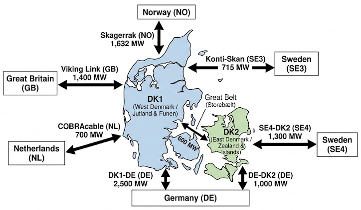 Figure 1: Interconnector capacities linking the Danish bidding zones (DK1, DK2) to neighbouring markets.
Interconnector Capacities
| Bidding Zone Border | Interconnector / Route | Nominal Capacity (MW) | Primary Characteristics |
|---|---|---|---|
| DK1 $\leftrightarrow$ DK2 | Great Belt Link (Storebælt) | 600 MW | Internal HVDC link bridging continental Denmark and Zealand |
| DK1 $\leftrightarrow$ DE | Jutland–Germany border | 2,500 MW | AC onshore border (expanding toward 3,500 MW) |
| DK1 $\leftrightarrow$ NO2 | Skagerrak 1–4 | 1,632 MW | Subsea HVDC to Southern Norway |
| DK1 $\leftrightarrow$ GB | Viking Link | 1,400 MW | Long-distance subsea HVDC to Great Britain |
| DK1 $\leftrightarrow$ SE3 | Konti-Skan | 715 MW | Subsea HVDC to Southwestern Sweden |
| DK1 $\leftrightarrow$ NL | COBRAcable | 700 MW | Subsea HVDC to the Netherlands |
| DK2 $\leftrightarrow$ SE4 | Øresund | 1,300 MW | AC subsea connection to Southern Sweden |
| DK2 $\leftrightarrow$ DE | Kontek and Kriegers Flak | 1,000 MW | Subsea HVDC (600 MW Kontek + 400 MW offshore grid) |
A simple example shows how clearing works. Three producers offer power at 50, 60, and 70 €/MWh. Three consumers bid at 65, 55, and 75 €/MWh. Match the cheapest offers to the highest bids until supply meets demand, and the price settles at 60 €/MWh. The producer at 70 €/MWh and the consumer at 55 €/MWh miss out. Everyone else trades at 60.
If the line between two zones can carry the flow, both zones clear at the same price. If it’s congested, prices split, and the importing zone gets more expensive. That’s why DK1 and DK2 often diverge, and why EPADs (Electricity Price Area Differentials) exist, as a hedge against exactly this.
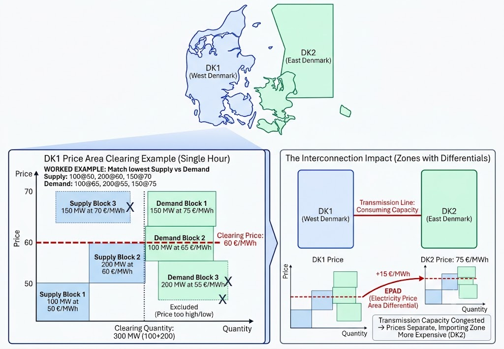 Figure 2: Day-ahead price divergence between DK1 and DK2 when interconnector capacity is congested.
1.3 Electricity Price Forecasting
There are two ways to forecast electricity prices: point forecasts and probabilistic forecasts. A point forecast is simple: one number, easy to check with MAE or RMSE, easy to drop into a spreadsheet. But a single number can hide a lot. A forecast can look accurate on average and still miss the risk that actually matters, the chance of a spike, a negative price, a correlation across hours. Two forecasts can share the same expected price and still call for completely different decisions, depending on how much uncertainty sits behind that number [4].
The following comparison makes the point:
| Situation 1 (stable) | Situation 2 (volatile) | |
|---|---|---|
| Expected day-ahead price | 80 €/MWh | 80 €/MWh |
| Forecast distribution | Tightly centred around 80 €/MWh | Very wide |
| Typical range | 75–85 €/MWh | –20 to 200 €/MWh |
| Probability of a spike (>150 €/MWh) | <1% | 25% |
| Likely response | Battery operator bids normally, consumer locks in the price, trader takes a standard position | Battery operator prepares for arbitrage, consumer hedges, trader reduces exposure or uses options |
Same expected price, very different risk. That’s exactly what a probabilistic forecast is built to capture.
A probabilistic forecast doesn’t give one number. It describes the whole range of plausible outcomes, and how likely each part of that range is. Instead of “80 €/MWh,” it says something like: 10% chance the price is below 55, 50% chance it’s below 78, 10% chance it’s above 110. That extra information matters for a few reasons:
- It captures real uncertainty. Prices are volatile and spike-prone. Quantiles, intervals, and densities capture that directly, both the normal outcomes and the extreme ones.
- It supports better decisions. Bidding, trading, storage, hedging: these all depend on risk, not just the average price. A probabilistic forecast tells two situations with the same mean apart.
- It manages tail risk. Spikes, negative prices, scarcity events: these carry large economic consequences. Quantifying tail probabilities supports Value-at-Risk and similar strategies.
- It plugs into optimization. Unit commitment, dispatch, battery scheduling, market bidding: these models need uncertainty as an input, not just a point estimate.
2. Methodology
2.1 The Four Ways to Express Uncertainty
PEPF, probabilistic electricity price forecasting, is the umbrella term for representing that uncertainty instead of collapsing it into one number. Dudek, Piotrowski, Kopyt and Baczyński [4] group the options into four categories:
- Quantiles: a set of values, each labelled with the probability of the price being below it.
- Prediction intervals: a lower and upper bound, labelled with the probability that the price falls inside.
- Predictive densities: the full probability distribution, or equivalently the full cumulative distribution function, for each hour.
- Multivariate scenarios: full price paths across all 24 hours, keeping the relationship between hours intact. Battery arbitrage, for instance, cares about the spread between hour 4 and hour 18. Independent hourly distributions can’t tell you that.
This post sticks to quantiles and prediction intervals: the natural starting point, and what most practical systems actually use. Densities and scenarios are a story for another day.
a. Quantiles
A quantile splits a distribution at a chosen probability. The τ-quantile (τ between 0 and 1) is the price level that’s exceeded with probability 1 − τ.
If the 0.25 quantile for tomorrow at 18:00 is 44 €/MWh, that means the price falls below 44 €/MWh about a quarter of the time, in similar situations. The 0.5 quantile is the median. Very low and very high τ describe the tails.
In practice, a forecast predicts a whole set of quantiles: the nine deciles (τ = 0.1 to 0.9) are common. Denser grids (τ = 0.01 to 0.99) sharpen the tails but cost more to compute. Always report which grid was used, since tail-sensitive scores depend on it.
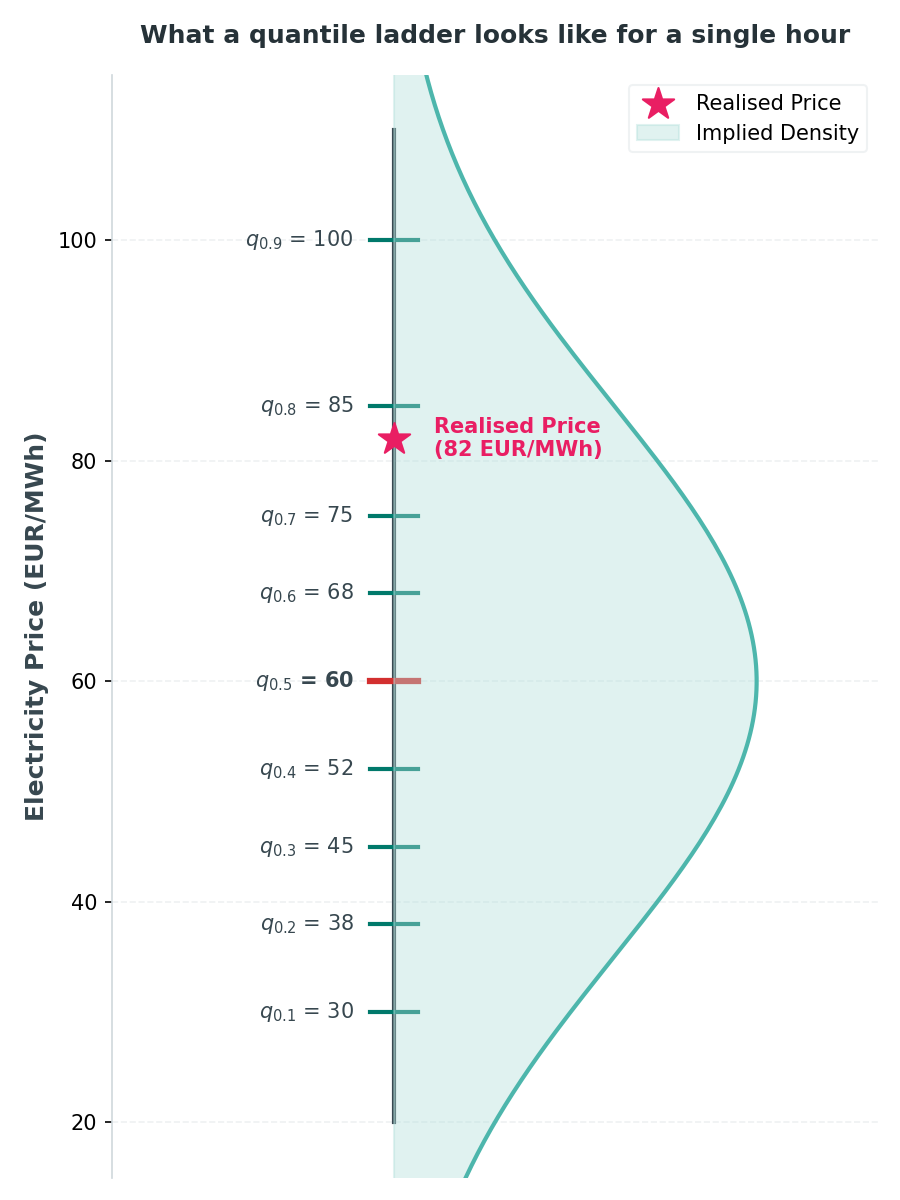 Figure 3: Quantile ladder. For a single hour, the forecast outputs nine price levels ($q_{10}, \dots, q_{90}$), slicing the implied probability density (shaded). The star marks where the actual outcome fell.
The ladder in the figure runs $q_{10} = 30$ up to $q_{90} = 100$ €/MWh, with the median $q_{50} = 60$. The realised price that hour was 82 €/MWh, marked with the star: it sits between $q_{70} = 75$ and $q_{80} = 85$, above the median but comfortably inside the upper half of the ladder. Reading it as a forecast report card: the median alone would have missed by 22 €/MWh, but the ladder’s upper rungs already signalled a real chance of a price this high, and the 80% interval ($q_{10}$ to $q_{90}$, 30 to 100) would have covered the outcome with room to spare. That’s the point of publishing the whole ladder instead of a single number: the median can be off by a wide margin and the forecast can still be doing its job.
b. Prediction Intervals
Pair two quantiles and you get a prediction interval: a lower and upper bound. A central interval with coverage 1 − α runs from the α/2 quantile to the 1 − α/2 quantile:
- 80% interval → $[q_{0.10}, q_{0.90}]$
- 90% interval → $[q_{0.05}, q_{0.95}]$
- 95% interval → $[q_{0.025}, q_{0.975}]$
If the 95% interval for tomorrow at 18:00 is 10–30 €/MWh, the price should land inside that range 95% of the time, and miss it 5% of the time.
c. Width
The size of a prediction interval is its width: the upper bound minus the lower bound.
\[\text{Width}_\alpha = q_{(1+\alpha)/2} - q_{(1-\alpha)/2}\]For example:
- 80% interval width = $q_{0.90} - q_{0.10}$
- 90% interval width = $q_{0.95} - q_{0.05}$
- 95% interval width = $q_{0.975} - q_{0.025}$
Width says how much uncertainty the model is expressing, not whether that uncertainty is warranted, that’s what coverage is for. A small width means a tight interval, a confident forecast; a large width means a cautious one. It’s measured in €/MWh, the same units as the price itself, so it’s directly interpretable without any conversion.
2.2 Probabilistic Forecasting Models
Aslam et al. [2] classify probabilistic forecasting methods into two major categories:
- Parametric models, which assume a specific distribution for the residuals:
- Gaussian
- Beta
- Gamma
- Weibull
- Gumbel
- Cauchy
- Logit-normal
- Mixed distributions
- Non-parametric models, which learn uncertainty from data instead of assuming a shape:
- Typical non-parametric methods: Quantile regression (QR), Bootstrap
- LUBE methods (Lower-Upper Bound Estimation): Traditional LUBE, Advanced LUBE
This work considers Quantile Regression (QR) and Quantile Regression Forest (QRF), following the formulation in [5].
2.2.1 Quantile Regression
Quantile Regression is ordinary linear regression with a twist: it estimates conditional quantiles instead of the conditional mean. That makes it a good fit when the data show heteroscedasticity, skewness, or outliers, since different quantiles pick up different parts of the distribution.
Formally: for a conditional distribution $F(y \mid X = x)$, the conditional quantile $Q(\alpha \mid X = x)$ is the smallest $y$ for which the probability of a lower value is at least $\alpha$:
\[Q(\alpha \mid X = x) = \inf\{y : F(y \mid X = x) \geq \alpha\}\]Quantile Regression approximates this quantile with a linear model:
\[f_\alpha(x) = x^\top \theta_\alpha\]The parameters $\theta_\alpha$ come from minimizing the quantile loss, which penalizes over- and under-prediction unevenly:
\[L_\alpha(\hat y, y) = \begin{cases} \alpha (y - \hat y) & y \geq \hat y \\ (1-\alpha)(\hat y - y) & y < \hat y \end{cases}\]so that:
\[\hat\theta_\alpha = \arg\min_\theta \frac{1}{N}\sum_{i=1}^N L_\alpha\big(f_\alpha(x_i), y_i\big)\]Train one model per quantile level, and together they build a full conditional distribution, with no assumption about its shape. Lasso or Ridge regularization can be added to fight overfitting. That makes QR a good fit for imbalance prices, where the distribution is often skewed and driven by extreme events.
2.2.2 Quantile Regression Forest
A Random Forest builds many decision trees on bootstrapped subsets of the data, a method called bagging. For each tree, a prediction comes from passing input $x$ down to a leaf and averaging the training samples stored there. Average across all trees, and the forest approximates the conditional mean $\mathbb{E}[Y \mid X = x]$.
Quantile Regression Forest (QRF) pushes this further: instead of storing just the average in each leaf, it keeps every training sample, which lets it estimate the whole conditional distribution, not just its mean.
Tree Structure and Leaf Weight
Each tree, grown with parameters $\theta$ and denoted $T(\theta)$, splits a bootstrapped subset $B$ into leaf regions $R_\ell$. Every observation lands in exactly one leaf. For an input $x$, find its leaf $\ell(x, \theta)$ and weight each bagged observation:
\[w_i(x, \theta) = \frac{\mathbb{1}\{X_i \in R_{\ell(x,\theta)}\}}{\#\{j : X_j \in R_{\ell(x,\theta)}\}}\]so the tree prediction is the weighted average:
\[\hat\mu_T(x) = \sum_{i=1}^N w_i(x, \theta)\, y_i\]A Random Forest with $K$ trees averages these weights,
\[w_i(x) = \frac{1}{K}\sum_{t=1}^K w_i(x, \theta_t)\]giving the conditional mean estimate:
\[\hat\mu(x) = \sum_{i=1}^N w_i(x)\, y_i \tag{1}\]A minimal example. Suppose four training prices land in the same leaf as $x$: 40, 50, 50, and 60 €/MWh, each carrying equal weight. The conditional mean is just their average,
\[E[Y \mid X = x] = \frac{1}{n}\sum_{i=1}^n y_i = \frac{40 + 50 + 50 + 60}{4} = 50 \text{ €/MWh,}\]which is exactly what equation (1) reduces to when every sample in the leaf carries the same weight.
Conditional Distribution Estimate
QRF replaces the mean with a full conditional cumulative distribution function (CDF):
\[F(y \mid X = x) = P(Y \leq y \mid X = x) = \mathbb{E}\big[\mathbb{1}\{Y \leq y\} \mid X = x\big]\]which the forest weights approximate as:
\[\hat F(y \mid X = x) = \sum_{i=1}^N w_i(x)\, \mathbb{1}\{y_i \leq y\}\]No Gaussian assumption, no assumed shape at all, just a nonparametric estimate built straight from the data.
Conditional Quantile Estimate
The conditional quantile is defined, as before, as:
\[Q(\alpha \mid X = x) = \inf\{y : F(y \mid X = x) \geq \alpha\}\]and QRF approximates it using the estimated CDF:
\[\hat Q(\alpha \mid X = x) = \inf\{y : \hat F(y \mid X = x) \geq \alpha\} \tag{2}\]A minimal example. Using the same four leaf values, sorted: 40, 50, 50, 60 €/MWh. The empirical CDF is $\hat F(40) = 0.25$, $\hat F(50) = 0.75$, $\hat F(60) = 1.00$. Applying
\[Q_\tau(Y \mid X = x) = \inf\{y : F(y \mid X = x) \geq \tau\}\]gives $Q_{0.1} = 40$ (since $\hat F(40) = 0.25 \geq 0.1$), $Q_{0.5} = 50$ (since $\hat F(40) = 0.25 < 0.5$ but $\hat F(50) = 0.75 \geq 0.5$), and $Q_{0.9} = 60$. Same four numbers as the mean example, but three different summaries depending on which slice of the distribution is asked for.
Decision trees pick up nonlinear relationships and interactions naturally, which makes QRF a good match for imbalance prices: heavy tails, sudden jumps, nonlinear dependencies, and heteroscedasticity, all in one.
Two models, then. The next question: how do we judge the distributions they produce?
2.3 Evaluation Metrics
MAE and MSE are the standard metrics for regression, but they only work for point forecasts. They can’t judge a distribution. Four metrics can: Pinball Loss, the Continuous Ranked Probability Score, the Probability Integral Transform histogram, and Empirical Coverage.
a. Pinball Loss (Quantile Loss)
Pinball loss is the workhorse for scoring quantile forecasts. For a predicted quantile $q$ at level $\tau$ and a realised price $y$:
\[PL_\tau(q, y) = (y - q)\big(\tau - \mathbb{1}\{y < q\}\big)\]$\mathbb{1}{y < q}$ is 1 if the price came in below the prediction, 0 otherwise. Written as two cases, it’s easier to read:
\[PL_\tau(q, y) = \begin{cases} \tau (y - q) & \text{if } y \geq q \quad \text{(under-predicted)} \\ (1-\tau)(q - y) & \text{if } y < q \quad \text{(over-predicted)} \end{cases}\]The whole point is the asymmetry. At τ = 0.9, sitting below the actual price costs nine times more than sitting above it. That’s exactly what pushes the fitted 0.9 quantile up, until only about 10% of outcomes exceed it. At τ = 0.5, the two penalties match, and the loss turns symmetric: that’s median regression. Lower is better; zero is a perfect hit.
The same logic runs in reverse at the low end. Low quantiles (τ = 0.1) are supposed to sit below the actual price about 90% of the time, so under-prediction is the expected, cheap outcome, while over-prediction is heavily penalised. The median (τ = 0.5) expects to sit right in the middle, so under-prediction is just as expensive as over-prediction, with no free pass in either direction.
Worked example. Say a model predicts $q_{0.1} = 55$, $q_{0.5} = 78$, $q_{0.9} = 110$ €/MWh for tomorrow at 18:00, and the price comes in at 96 €/MWh.
| τ | predicted q | actual y | case | pinball loss |
|---|---|---|---|---|
| 0.1 | 55 | 96 | $y \geq q$, under-predicted | $0.1 \times (96 - 55) = \mathbf{4.10}$ |
| 0.5 | 78 | 96 | $y \geq q$, under-predicted | $0.5 \times (96 - 78) = \mathbf{9.00}$ |
| 0.9 | 110 | 96 | $y < q$, over-predicted | $0.1 \times (110 - 96) = \mathbf{1.40}$ |
Average pinball loss for this hour: $(4.10 + 9.00 + 1.40) / 3 = \mathbf{4.83}$ €/MWh.
The 0.9 quantile missed high by 14 €/MWh, and was only charged 1.40 for it, because sitting above the outcome is exactly what a 90% quantile is supposed to do most of the time. The median missed by 18 and was charged 9.00. That gap is the asymmetry doing its job.
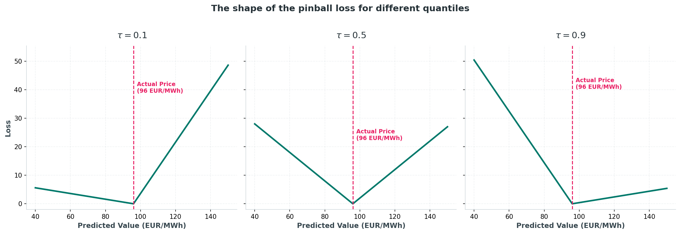 Figure 4: Pinball loss as a function of forecast error, shown separately for a low, a middle, and a high quantile level, illustrating how the penalty slope flips sign around the predicted quantile. Adapted from [5].
This means:
| Quantile level | Under-prediction | Over-prediction | Shape |
|---|---|---|---|
| Low (τ = 0.1) | Cheap | Expensive | Skewed, shallow on the left |
| Median (τ = 0.5) | Costs the same as over-prediction | Costs the same as under-prediction | Symmetric V |
| High (τ = 0.9) | Expensive | Cheap | Skewed, shallow on the right |
A handy shortcut: at τ = 0.5, pinball loss is half the absolute error. Here, the median missed by 18, and the loss was 9, exactly half. So to compare a median pinball loss with a familiar MAE, double it. (Some papers skip that factor of 2 and just call τ = 0.5 pinball loss the MAE. It’s only proportional, so check the convention before comparing across papers.)
Over a full evaluation, the loss is averaged across all days, hours and quantile levels:
\[PL = \frac{1}{T \cdot H \cdot K} \sum_{t=1}^{T} \sum_{h=1}^{H} \sum_{k=1}^{K} PL_{\tau_k}\big(q^{(\tau_k)}_{t,h}, y_{t,h}\big)\]with $H = 24$ for hourly day-ahead forecasts and $K$ the number of quantiles.
As a rule of thumb, median pinball loss for a decent day-ahead model lands around 10–30% of the average price level, higher for balancing prices. It’s not a strict rule, just a typical range seen in practice. So at an average price of 100 €/MWh, a decent model’s median pinball loss sits around 10–30 €/MWh; at 150 €/MWh, that’s roughly 15–45 €/MWh.
Don’t chase an absolute number on its own, either. Pinball loss depends heavily on price volatility, market regime, spikes, negative prices, season, and model type, so a loss of 20 might be excellent in one market and terrible in another; the number means nothing without context. Report it against a naive benchmark instead, the same hour a week earlier works well, so a reader can see whether the model beats a trivial guess.
b. CRPS (Continuous Ranked Probability Score)
Pinball loss scores one quantile at a time. CRPS scores the whole distribution in a single number. For a predictive CDF $F$ and a realised price $y$:
\[CRPS(F, y) = \int_{-\infty}^{\infty} \big(F(z) - \mathbb{1}\{y \leq z\}\big)^2 \, dz\]Picture it geometrically: $\mathbb{1}{y \leq z}$ is a step that jumps from 0 to 1 at the actual price, and CRPS is the squared area between the forecast CDF and that step. The closer the CDF hugs the step, the better the forecast.
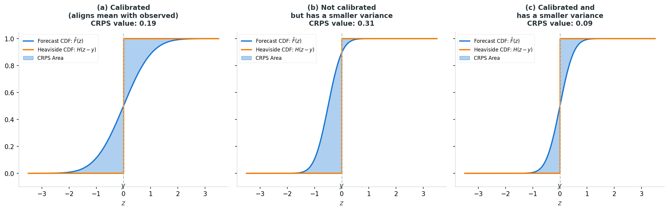 Figure 5: CRPS as the squared area between the predictive CDF $F(z)$ and the step function at the observed price $y$; the shaded region being integrated in the CRPS formula. Adapted from [5].
Three normal predictive distributions scored against the same outcome ($y = 0$) show what that area rewards: wide-but-centred scores CRPS = 0.194; narrow-but-off-centre scores CRPS = 0.315, the worst of the three, because it’s confidently wrong; narrow-and-centred scores CRPS = 0.093, the best. CRPS rewards being both close to the outcome (calibration) and confident about it (sharpness), and it penalises overconfidence more than it rewards narrowness when the two conflict.
In practice, nobody computes that integral directly. Given a dense grid of quantiles, CRPS is well approximated by twice the average pinball loss across the grid:
\[\widehat{CRPS}(F, y) \approx \frac{2}{|Q|} \sum_{\tau \in Q} PL_\tau\big(q^{(\tau)}, y\big)\]Lower is better, it’s expressed in €/MWh, and for a point forecast it reduces exactly to the absolute error, which is what makes it directly comparable to MAE. Like pinball loss, it’s scale-dependent, so only compare it within the same market and price regime, and pair it with a coverage check, since a badly calibrated but wide forecast can lower its CRPS without actually being sharper.
A minimal example. Suppose a simplified predictive distribution puts 20% probability on 40 €/MWh, 50% on 50 €/MWh, and 30% on 60 €/MWh, and the actual price comes in at 45 €/MWh. The predictive CDF is a staircase: 0 below 40, 0.2 between 40 and 50, 0.7 between 50 and 60, and 1 above 60. Squaring the gap between that staircase and the step that jumps to 1 at 45, and summing across each price interval, gives $(0.2)^2 \times 5 + (0.2 - 1)^2 \times 5 + (0.7 - 1)^2 \times 10 = 0.2 + 3.2 + 0.9$, or CRPS ≈ 4.3 €/MWh. Most of that comes from the interval right around the outcome, exactly where the staircase is still far from the step.
c. Probability Integral Transform Histogram
One more calibration check: the Probability Integral Transform (PIT) histogram. For each time $i$, the PIT value is $\hat F_i(y_i)$, the predicted CDF evaluated at the true outcome $y_i$. Collect these values across many predictions, build a histogram, and it shows where the truth tends to fall inside the predicted distribution. The logic rests on a standard result: if $y \sim F$, then $F(Y) \sim U(0,1)$. So a well-calibrated forecast should produce a flat, uniform PIT histogram.
A minimal example. Suppose a predictive CDF is known at a few price points: $F(40) = 0.10$, $F(60) = 0.40$, $F(80) = 0.75$, $F(100) = 0.95$. The actual price comes in at $y = 72$ €/MWh, between the 60 and 80 points, so linearly interpolating between them gives $F(72) = 0.40 + \frac{72 - 60}{80 - 60}(0.75 - 0.40) = 0.40 + 0.6 \times 0.35 = \mathbf{0.61}$. That single number, PIT = 0.61, says the actual price landed at the 61st percentile of that day’s forecast; repeat this across many days and the resulting histogram is what Figure 6 visualises.
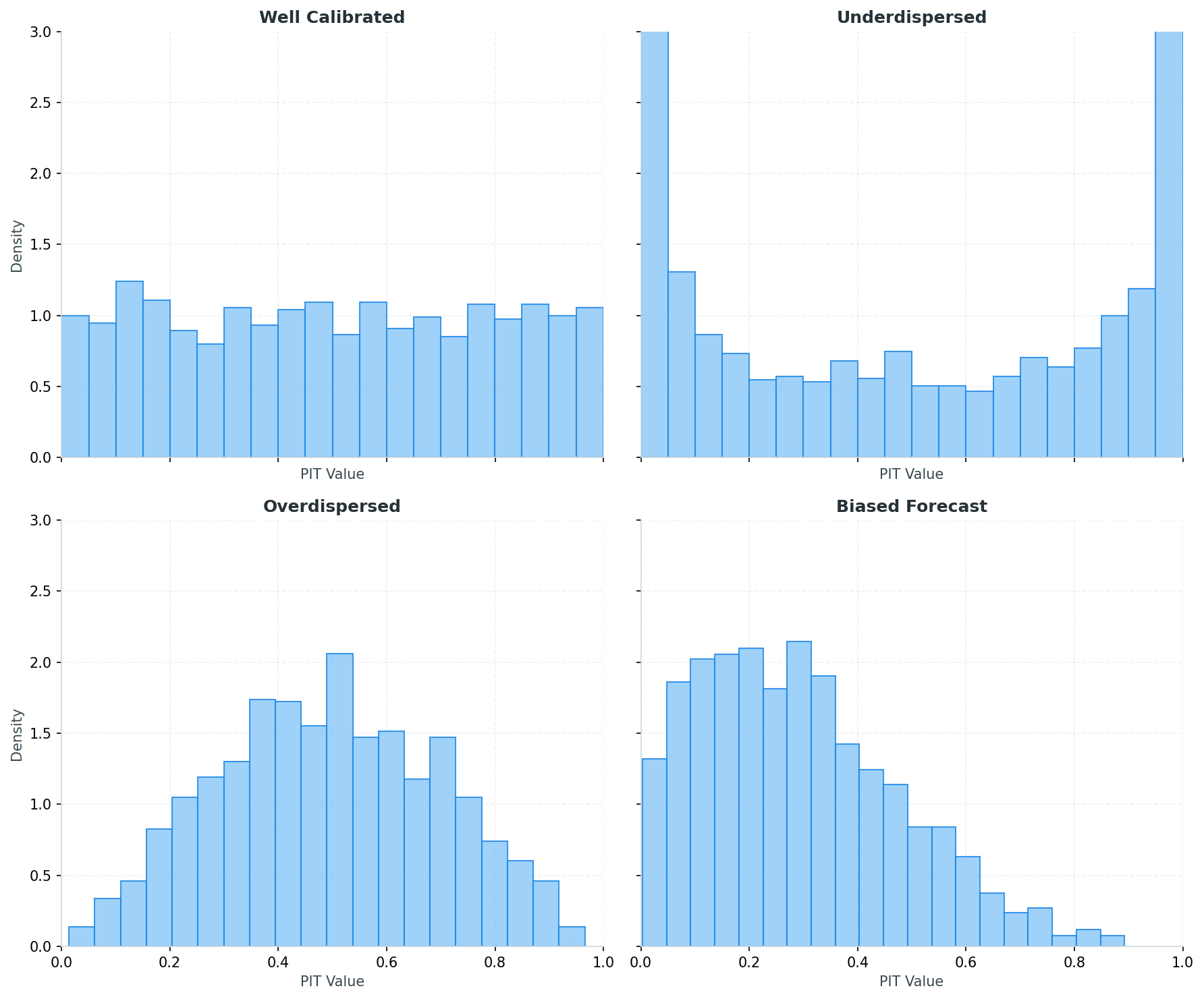 Figure 6: Example PIT histogram shapes: uniform (well-calibrated), U-shaped (forecasts too narrow), inverse-U (forecasts too wide), and skewed (biased forecasts). Adapted from [5].
Each panel is built from 1,500 simulated PIT values drawn from a distribution chosen to represent one failure mode. Well calibrated draws uniformly on $[0,1]$, so the bars are flat: every part of the predicted distribution catches the true price about equally often, which is what a trustworthy forecast looks like. Underdispersed draws from a Beta(0.4, 0.4) distribution, which piles mass at both ends near 0 and 1, producing the U-shape: the true price keeps landing in the extreme tails of the forecast, meaning the predicted interval was too narrow and missed more often than it should. Overdispersed draws from a Beta(2.5, 2.5), which concentrates mass near 0.5, producing the inverted U: the true price keeps landing near the centre of the forecast, meaning the interval was wider than it needed to be. Biased forecast draws from a Beta(1.5, 3.5), whose mean sits at 0.3 rather than 0.5, skewing the bars toward the low end: the true price is disproportionately below where the forecast expected it, meaning the model’s predictions run systematically too high.
In short, the shape of the histogram is the diagnosis:
| Shape | Bars | Numeric intuition (4 PIT values) | Diagnosis |
|---|---|---|---|
| Well-calibrated (uniform) | Flat across $[0,1]$ | 0.10, 0.40, 0.70, 0.90 — spread evenly | Good calibration |
| Under-dispersed (U-shaped) | Tall at both ends | 0.02, 0.95, 0.03, 0.97 — piled near 0 and 1 | Intervals too narrow |
| Over-dispersed (inverted-U) | Tall in the middle | 0.45, 0.52, 0.55, 0.48 — bunched near 0.5 | Intervals could be tighter |
| Biased forecast (skewed) | Concentrated near 0 or near 1 | 0.05, 0.12, 0.18, 0.22 — mostly near 0 | Systematic over- or under-prediction |
d. Empirical Coverage
Pinball loss, CRPS, and PIT all judge the shape of the distribution. Empirical coverage asks something simpler: for a stated interval, how often does the actual price land inside it?
For a central interval $[\hat Q_{\alpha/2}, \hat Q_{1-\alpha/2}]$ evaluated over $T$ hours:
\[\text{Coverage} = \frac{1}{T} \sum_{t=1}^T \mathbb{1}\big\{y_t \in [\hat Q_{\alpha/2,\,t}, \hat Q_{1-\alpha/2,\,t}]\big\}\]A nominal $(1-\alpha)$ interval, a 90% interval say, should contain the outcome about 90% of the time. Coverage close to nominal means the intervals are trustworthy; too low means they’re too narrow, the same failure the U-shaped PIT flags; too high means they’re too wide, the same as the inverted-U case. It’s PIT’s headline number condensed to one interval instead of a full histogram, and this is also what’s usually meant by PICP (Prediction Interval Coverage Probability).
A minimal example. Ten hours, each with a stated 90% interval. The actual price lands inside it for 8 of the 10 hours:
\[\text{Coverage} = \frac{8}{10} = 0.80 = 80\%\]The model promised 90% coverage but delivered 80%, so the intervals are too tight and should be widened.
import numpy as np
import matplotlib.pyplot as plt

hours = np.arange(1, 11)
q_low = np.array([40, 42, 38, 45, 50, 47, 43, 39, 41, 44])
q_high = np.array([70, 72, 68, 75, 80, 77, 73, 69, 71, 74])
actual = np.array([55, 60, 50, 90, 65, 58, 30, 62, 68, 59])

inside = (actual >= q_low) & (actual <= q_high)
coverage = inside.mean()

fig, ax = plt.subplots(figsize=(9, 5.5))
for h, lo, hi, is_in in zip(hours, q_low, q_high, inside):
    ax.plot([h, h], [lo, hi], color="#00796B" if is_in else "#E91E63", lw=6, alpha=0.35)

ax.scatter(hours[inside], actual[inside], color="#00796B", label="Inside interval")
ax.scatter(hours[~inside], actual[~inside], color="#E91E63", marker="X", label="Outside interval")
ax.set_xlabel("Hour")
ax.set_ylabel("Price (EUR/MWh)")
ax.set_title(f"90% intervals across 10 hours — empirical coverage = {coverage:.0%}")
ax.legend()
plt.show()
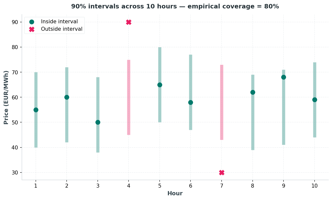 Figure 7: The same 10-hour, 8-of-10 example as a picture: each bar is one hour’s stated 90% interval, dots are the actual price, and colour marks whether the outcome landed inside (teal) or outside (pink) the interval.
That’s it for this post. Next time: applying all this to DK1.
Next: Part 2 implements QR and QRF end to end on real DK1 data with walk-forward cross-validation, and Part 3 adds bootstrapped residuals and split conformal prediction, with all four methods compared head to head.
References
- [1] EPEX SPOT, “Basics of the Power Market.” [Online]. Available: www.epexspot.com/en/basicspowermarket. Accessed: Aug. 4, 2026.
- [2] M. G. Aslam, M. A. Khan, and M. J. Khan, “An overview of deterministic and probabilistic forecasting methods of wind energy,” Energy Reports, vol. 8, pp. 140-154, 2022.
- [3] T. Oliveira, “Understanding Day-ahead & Intraday Markets,” Synertics, May 15, 2023. [Online]. Available: synertics.io/blog/39/understanding-day-ahead-intraday-markets. Accessed: Aug. 4, 2026.
- [4] G. Dudek, P. Piotrowski, M. Kopyt, and D. Baczyński, “Recent Advances in Probabilistic Electricity Price Forecasting: A Review of Methods and Evaluation Metrics,” Energies, vol. 19, no. 15, p. 3552, Jul. 2026.
- [5] S. Fredriksson, “Probabilistic Imbalance Price Forecasting and a Study of Sudden Price Shifts,” M.S. thesis, Uppsala University, Uppsala, Sweden, 2025.
Code
- make_theory_figures.py: generates Figures 3 through 7 (quantile ladder, pinball loss shape, CRPS panels, PIT histograms, empirical coverage) from the synthetic values discussed above.